![]()
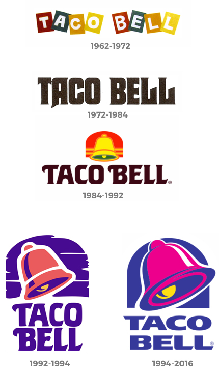
Taco Bell Logos Over the Years
The New Taco Bell Logo
Taco Bell introduced a new logo designed by Lippincott and Taco Bell’s internal design group, TBD at the opening of a flagship Taco Bell Cantina in Las Vegas, Nevada.
The new logo brings in a more modern look with a purple color for the bell and black for the type. The font choice seems a bit more modern than what the brand is known for. A more custom font choice would have been a better way to go. You can see the new Taco Bell logo below. What do you think? Do you think the new logo represents the brand as well as the old logo did? Tell me your thoughts by commenting below!